I have many plans for our master bedroom.
One of them being that I would get it done in 2012, I believe I even made that a
non-resolution resolution on Kyla's blog last year.
Well, that didn't happen.
(I can't explain what is happening with the paint here. It goes in the file of questions that shall never be answered by the former owners of this house.)
We've been saying that we need to paint the room since we moved in over two years ago. Currently, as demonstrated by the picture above, it's beige with a patches of off-white.
It's at the top of our list of priorities but somehow we end up starting other projects instead (painting the spare bedroom on Christmas Eve?).
I think one of the biggest problems is that I can't pick a colour. I'm having a moment where I want to paint everything everywhere white.
(source: http://juliasvitadrommar.blogspot.ca)
Yes, 86% of Pinterest and I are digging that look. But that just won't work with what we have, it is impractical and it's also not exactly Matt's favourite way to decorate. And so, we're still living in a room with so much potential but with a bad paint job and stuff scattered everywhere. We close that door when company comes over. Unless we really like you, then we're OK with sharing that mess.
Then Glidden asked me to try their new
My Image Inspiration tool to show how one can use any inspiration picture to pick out paint colours. And it's embarrassing but yes, it took a sponsored post for me to get my butt in gear and make some decisions. Decisions about what furniture to keep, what to look for and most importantly what colour to finally paint that stupid room.
You can use any picture anywhere as your inspiration when you use the
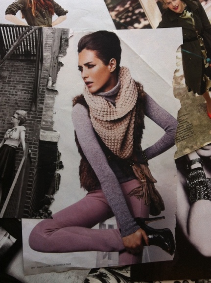
My Image Inspiration tool but I was going through my old magazine tear aways and I loved the colours and tones in this particular picture.
(ripped from a Marie Claire in 2009)
I knew this would be the perfect picture to get my inspiration from. But before I use the
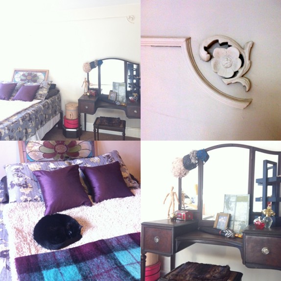
My Image Inspiration tool to finally pick a paint colour, I just want to share some elements that are in the room currently. These pictures are after I cleaned up the laundry and the crap lying around and did some serious organization. Not going to lie, the other side of the room is still a mess.
- We have this amazing original moulded flower trim. I want these painted white to contrast them off the wall a bit.
- I found this vintage purple, teal and black Hudson's Bay blanket at a flea market (bottom left). I love that it is such an unusual colour combination and pattern from such an iconic Canadian company. It's also a nice contrast against the floral trim and vanity.
- This vanity was purchased at the closing sale of a antique store on Ottawa St.. It cost less than $100 if I remember correctly. It was intended for my closet, as a super girly indulgence but it blocks the light from the only window there and that is a little depressing. So I moved it into the bedroom.
- My parents gave us that stained glass window as a wedding present. There was an unfortunate accident and it took almost 2 years to get the window back from the guy who eventually fixed it. The only original part remaining is the centre flower but it is certainly more solid now. I wanted to originally hang these refinished windows (refinished by Better Than New ) above the bed but I am not sure the wall can handle all that weight. I might be afraid to sleep under those heavy windows hung perilously above my head. The stained glass window is much lighter and is, of course, a special sentimental piece.
It kinda happened by accident but there is definitely a mocha and purple theme that is developing in the bedroom. And the fashion editorial I ripped out of that magazine years ago, captures the colour direction that is starting to come together in my head.
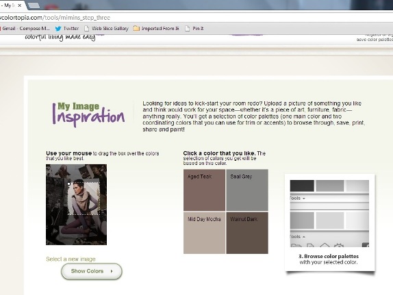
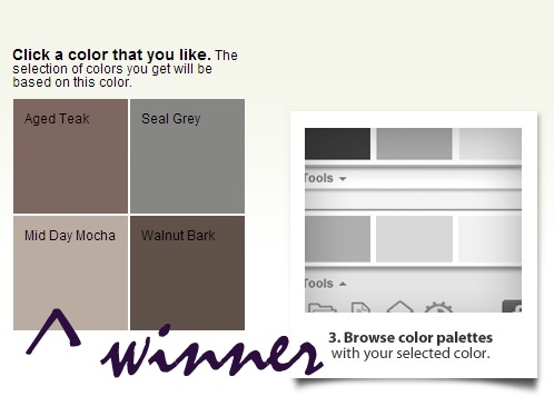
It's ridiculously easy to use the
My Image Inspiration tool. You upload any picture (off your own files or the internets), select an area of the photo to focus on and a selection of colours pop up. You can click around on different areas of the same image to see additional colours as well. Once you have selected a colour, you can go to step three and search colour palettes that correspond to your original colour choice.
And now you are probably biting your nails in anticipation over what colour we picked for our bedroom. Well, after some serious consideration and a flurry of text messages, we're going with
Mid Day Mocha. It's the exact shade of grey/brown/purple we are looking for...;) No more changing my mind, I'm sticking with this.
Can't wait to finally have a nice bedroom!
Also, you are cordially invited over for a paint party. There will be wine and cheese in exchange for the labour of painstakingly painting around each floral moulding.
*I have been sponsored by Glidden® brand paint to write this post but the thoughts and opinions expressed are totally my own.